Is Your Website Mobile Friendly?
July 20, 2015
What Does “Quality Content” Actually Mean?
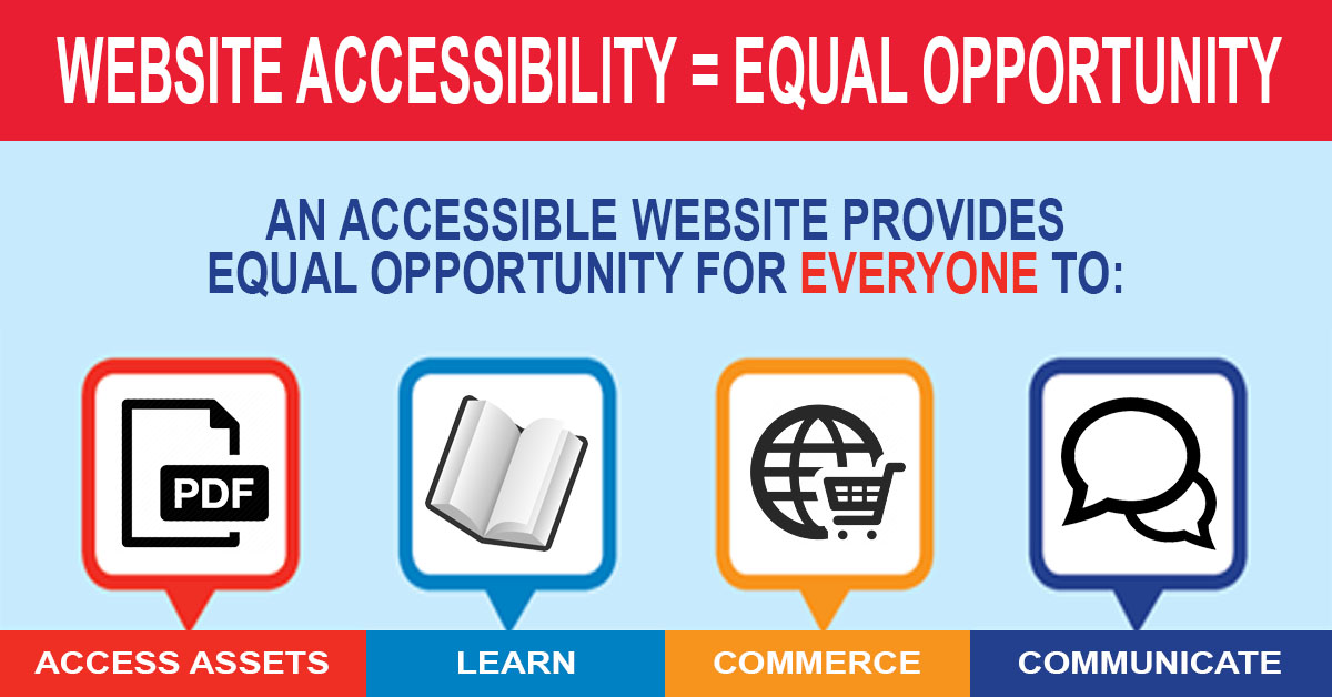
August 13, 2015Every day, poor web design prevents many people from having a comfortable online experience. For those with visual impairments, hearing loss, or learning difficulties – a significant share of Internet users – it can be a challenge to use and interact with websites that aren’t designed with accessibility in mind.
From a commercial perspective, if businesses don’t consider disabled users, they’re alienating a huge portion of the market, so making a website more accessible just makes good business sense.
The benefits of accessible design are clear:
- More people can use your website, resulting in more potential customers
- Accessible websites are more mobile friendly
- Accessible design complements search engine optimization (SEO)
With this in mind, here are nine simple techniques you can use to build a more accessible and user-friendly website.
Be Consistent
For those using screen readers (software that reads text on a website out loud) and anyone with cognitive impairments, consistency in design is crucial. With the same elements presented in the same place on every page, it’s much easier to navigate a website. If possible, keep the navigation, heading positions, and layout the same on every page.
Use Headings to Strengthen Comprehension
Using headings correctly is not only good for human readers, it’s also good for SEO. By using <H1> and <H2> tags for headings, the content will be better organized and easily interpreted by search engine robots and screen readers. Besides, it also makes the page more readable and scannable for sighted users.
Include Alt Text for Images
For visually impaired users – and search engines – the only way to understand an image is through its alternative text. This is especially important for informative images such as infographics. Be as descriptive as possible when adding alt text to images using relevant keywords to boost SEO.
Use Descriptive Links and Buttons
Just as sighted users search web pages for links and buttons, visually-impaired users use their screen readers to scan for links. When including a link in your content, always use text that describes where the link goes, and makes sense when read out of context. For example, avoid “Click Here” or “More”. If possible, underline links or make sure they’re a different color so that colorblind users can easily identify them.
Use Appropriate Language
Easy-to-understand copy not only helps those with learning difficulties and non-native speakers, it’s helpful for any audience. Break large chunks of text into smaller paragraphs, write shorter sentences, use straightforward language, and use white space and bullet points to make pages more scannable.
Include a “Skip to Main Content” Link
Using a screen reader can be frustrating, as it will read every navigation link one by one before it gets to the main content. To make pages more accessible, put a link in the top left-hand column pointing to the main content and use simple language like “skip to main content” or “skip navigation links”.
Be Aware of Color
Visually-impaired and color-blind users rely on sufficient color contrasts to understand web content, so make sure foreground and background colors have a high color contrast. Also avoid blue, yellow, and green close together, which can cause problems for some colorblind users.
Ensure Content Can Be Accessed Using a Keyboard
Many people don’t use a mouse and must rely on a keyboard to navigate web pages. By pressing the “tab” or “arrow” keys, or using assistive technologies, they’re able to skip through links on a page. For this reason, make sure users can skip content in a logical order on the page. Break up long pages of content with descriptive links, and don’t use navigation links that only activate when users hover over them with a mouse.
Include Alternative Content
For those who are deaf or hard of hearing, it’s crucial to provide a text equivalent for non-text content. Videos should have alt tags and captions, and whenever possible try to include full transcripts of videos, as this is great for SEO. YouTube and other video platforms already offer tools to help users add subtitles to videos.
The Bottom Line
Obviously, these suggestions are only a small part of making your website more accessible to a diverse range of users. There are a wide range of disabilities and many more ways to make browsing a website easier, but this is a good place to start. Making your website more accessible is not only good practice, it’s good for business.
For help with developing your website with usability and accessibility in mind, please get in touch with StevenMilanese.comfor more information.
For more in-depth accessibility tips, visit the following pages:


