Nine Local SEO Tips for Small Businesses
July 13, 2015
Nine Tips for Making Your Website More Accessible
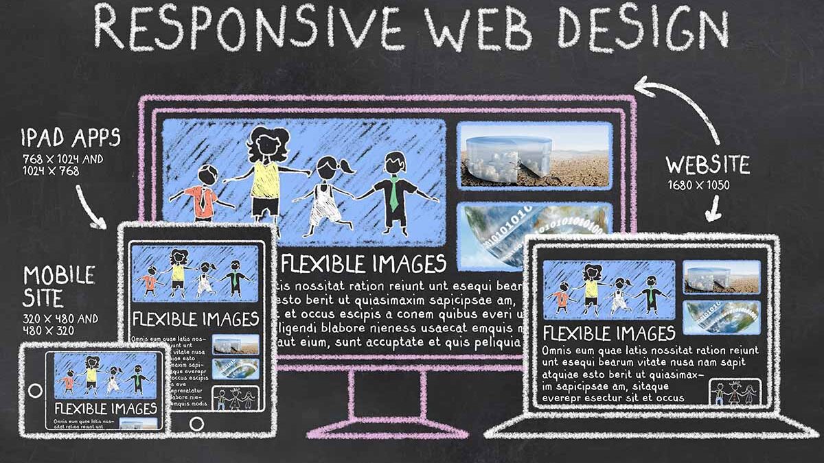
July 30, 2015In today’s digital landscape, it’s more important than ever to have a website that’s user-friendly and optimized for search engines. With Google’s latest mobile-friendly update that rewards mobile-friendly sites, and with more people searching the Internet on mobile devices, mobile-friendly web design has become an essential ingredient in accessibility and search engine optimization (SEO). Is your website designed with mobiles in mind?
This post will explain why every business should have a mobile-friendly website, and look at some of the best ways to ensure your website is built for a mobile audience.
The Importance of Mobile-Friendly Web Design
There are two main reasons why you should optimize your website for mobile devices:
- To create a user-friendly experience
- To boost your search engine visibility
In Google’s official AdWords blog in May 2015, they wrote: “Consumers are increasingly picking up their smartphones for answers. In fact, more Google searches take place on mobile devices than on computers in 10 countries including the US and Japan.” A recent ComScore study showed that around 56 percent of online content is now consumed on smartphones.
This presents a huge opportunity for marketers to reach more consumers who are using their mobiles to search the Internet. Google also measures the length of time people spend on websites and audience engagement data, so if you want to help your mobile search rankings, you need to ensure your site is mobile-friendly.
Tips to Make Your Website Mobile Friendly
Test Your Website
Mobile devices come in many sizes and forms. There are numerous free tools you can use to check whether your site displays correctly across these devices.
These free tools will all check how your website performs:
- Google’s Mobile-Friendly Test
- WC3 Mobile OK Checker
- Responsive Design Test by StudioPress
- HubSpot’s Marketing Grader
Avoid Creating a Separate Mobile Website
Having one site for mobile content and one for desktop content can lead to duplicate content issues, which can result in Google penalties. Instead, use responsive design. This allows your one website to automatically adjust to whichever device is being used. What’s more, mobile-responsive design is recommended by Google.
Pay Attention to Font and Button Sizes
For mobile screens, a font size of at least 14 pixels is recommended. You don’t want your visitors to have to pinch and zoom every time they want to read your content. As for buttons, bigger is better – around 44 pixels by 44 pixels. This makes it easier for users to see buttons and tap on them without hitting other content.
Make Calls-to-Action and Contact Details Prominent
A call-to-action positioned at the top-right of your home page may show up below the fold on a mobile device. Check where your calls-to-action appear on mobile devices, and make sure any contact details are easily accessible from every page.
Avoid Multi-Level Menus
On mobile devices, a clear navigational structure is essential. Most mobile sites have a menu icon at the top that expands when tapped. Design your site with the least possible menu items, so people can find what they’re looking for with as few taps as possible.
Use High-Resolution Images
The latest iOS devices feature high-definition screens that have a significantly higher resolution than traditional desktops. To make sure your images look good on retina displays, upload only the highest quality image files to avoid images that look pixelated.
Use YouTube Videos
Some content – like Flash content, for example – doesn’t work on many mobile devices. If you have videos on your site, try using YouTube videos. They’re already embedded with responsive code, making them instantly mobile friendly.
Aim for Fast Load Times
As most mobile connections are often slower than normal Internet connections, it’s even more important to optimize your website’s loading speed. Use Google’s PageSpeed Tools and Insights to maximize efficiency.
Optimize Forms
Remember that filling out a form on a mobile device is a little more tricky than on a desktop, so keep form fields to a minimum. For example, a first name, last name, and email address is all you need for an email opt-in or registration form.
Optimize Content
Responsive design is important, but it’s also the content that makes a website more user-friendly and engaging. Use clear headlines, short paragraphs, bullets, and social sharing buttons to make your content more scannable and shareable.
Work With a Professional Web Developer or Digital Consultant
When it comes down to it, if you want a professional-looking website that is also mobile-friendly, you need help from a company that has the experience to get the job done efficiently and cost-effectively. StevenMilanese.com will help ensure you end up with a website that is not only built for the mobile generation, but also looks beautiful.
In Summary
Having a mobile-friendly website is not only important for usability and accessibility reasons, it’s also crucial for search engine rankings. Use these suggestions to make sure you stay one step ahead of the competition. If you need help optimizing your website for mobile, or have any other web development issues, give me a call today.
Image data resource: http://www.shopify.com/blog/16794380-3-ecommerce-trends-you-need-to-know-for-a-profitable-2015


