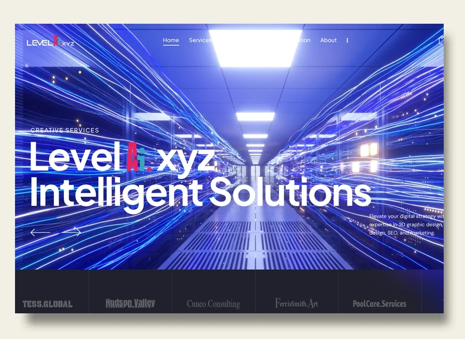
In today’s competitive technology landscape, establishing a strong brand identity is crucial to standing out and resonating with your target audience. For Level AI, a cutting-edge company focused on artificial intelligence solutions, the challenge was to create a logo and visual identity that not only showcased their technological expertise but also connected with a modern, millennial audience. Through an intensive design process, Level AI’s brand identity emerged as a bold, forward-thinking representation of the company’s mission and values. Here’s an in-depth look at how the logo and brand identity for Level AI were developed.
Brand Exploration and Competitive Research
The initial phase of the design process began with brand exploration and research. This involved gaining a thorough understanding of Level AI’s mission—pioneering advanced AI solutions—and their long-term vision for innovation. It was essential to capture the company’s focus on AI while also incorporating a modern, sleek aesthetic that would appeal to a younger, tech-savvy audience.
To ensure that the final logo design stood out in the crowded AI space, a competitive analysis was conducted. This involved analyzing the visual identities of both direct competitors in the artificial intelligence sector and those in adjacent tech industries. By identifying common themes and trends, the goal was to create something distinctive that set Level AI apart, yet communicated a clear connection to the AI industry.
The findings from this research played a critical role in shaping the design direction. It was clear that the brand needed to be modern, with an emphasis on innovation, while still maintaining an approachable and human-centric feel. This balance would be critical to ensuring that the brand could resonate with a wide audience.
Conceptualization of the Logo
The logo serves as the cornerstone of any brand identity, and for Level AI, it was vital to create a mark that was both memorable and versatile. The challenge was to balance technical precision with creativity—two characteristics that define the company’s AI-driven solutions.
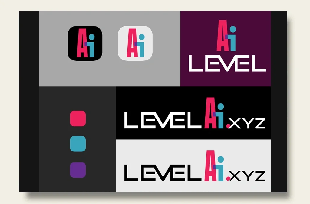
The design process began with several rounds of sketches and digital concepts. Various elements were explored, including abstract representations of AI and technology, but the final design emphasized simplicity and modernity. The focal point became the initials “AI,” which were stylized in a clean, geometric font that speaks to the company’s technological prowess. The decision to highlight the “AI” letters was intentional, making it immediately clear what the company specializes in, while also leaving room for future scalability and adaptation.
The “Level” portion of the logo was designed in a bold, uppercase font, providing contrast to the sleek “AI” portion. This contrast helped reinforce the dual aspects of Level AI: cutting-edge technology (AI) and strong, reliable foundations (Level).
Color Palette Development
Color is a powerful tool in brand identity, evoking emotions and creating connections with viewers. For Level AI, it was crucial to select a color palette that embodied the company’s innovative spirit while standing out in the saturated tech industry.
The chosen colors—vibrant magenta, cyan, and deep purple—serve as more than just aesthetic choices. Each hue carries symbolic meaning:
- Magenta: Represents creativity and innovation, aligning with the company’s mission to push the boundaries of AI.
- Cyan: Conveys intelligence and clarity, reflecting the precision and analytical nature of the company’s AI solutions.
- Purple: Symbolizes future-forward thinking and cutting-edge technology, a perfect fit for an AI-focused company.
These bold colors also appeal to millennial and Gen Z audiences, who gravitate toward vibrant, eye-catching designs. In addition to digital use, these colors were selected for their ability to stand out in print, ensuring a cohesive visual identity across all media.
Typography and Iconography
Typography is a critical aspect of any brand, as it contributes to the overall personality of the design. For Level AI, a clean, sans-serif font was chosen, ensuring readability and flexibility across both print and digital platforms. The typography complements the logo’s modern aesthetic, reinforcing the futuristic feel of the brand.
Iconography was kept minimal yet dynamic, reflecting the sophisticated and complex nature of AI technology. The focus was on ensuring that any icons used within the brand identity would be clear and immediately recognizable, enhancing user experience across all platforms.
Brand Guidelines Creation
To ensure consistency in how the logo and brand elements are used, a comprehensive set of brand guidelines was created. These guidelines include detailed specifications on the logo’s size, placement, and color variations, ensuring that the brand identity is applied consistently across all media.
The brand guidelines also provide best practices for how to use the typography and color palette, ensuring that the integrity of the design remains intact whether the logo appears on a business card, website, or social media platform.
Implementation Across Platforms
Once the brand identity was fully developed, the next step was to implement it across all relevant platforms. This included not only digital channels such as the Level AI website and social media profiles but also printed materials like business cards. The logo’s scalability ensured that it maintained its impact and legibility regardless of the platform or size.
Conclusion: A Bold New Identity for Level AI
The final result was a cohesive, visually striking brand identity that effectively communicates Level AI’s position as a leader in the artificial intelligence space. From the sleek, modern logo to the vibrant color palette, every element of the brand was designed to resonate with a tech-savvy, millennial audience while conveying the company’s innovative spirit.
Whether viewed on a business card or a digital screen, Level AI’s new visual identity stands out, making a bold statement about the company’s mission to lead the way in AI solutions.


